I have selected a few things for you to look over. So, lets get started!
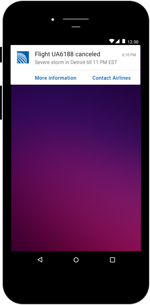
I would use app notification to deliver the message since users don't open their airline apps often.
However, since the information is critical and some users might not have a mobile app installed, I would also send the information via a text message and email. A text message does not require internet connection. An email is useful if there is free airport wifi but no mobile signal.
The updated copy does the following:
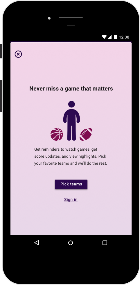
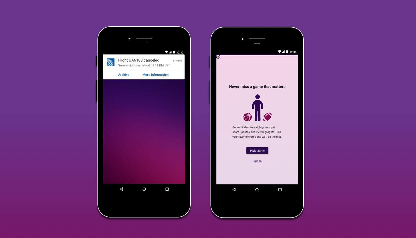
Fans don’t want to miss games of their favorite teams and the title promises that.
Following are the other versions I considered:
“Watch games, get scores, & see highlights”
Or
“Never miss another game”
The first choice informs the users about what the app does but does not tell the user why they might want to install it. It does not build an emotional connection. The second choice assumes that the users want to watch all the games which might not be true.
The body conveys the value proposition in detail. It also clearly states why users might be interested in installing this app. The body first informs the user about the value of the app and then communicates what they need to do. It also informs what users need to do to get that value.
The body could be shorter without “We‘ll do the rest”.But “we’ll do the rest” conveys that the product cares for the user so, I chose to include it. I also used “pick” instead of “select” because it sounds more casual. “Select” might be less ambiguous (especially for localization) but sounds more formal. Pick is clear for English users in America. This app focuses on college teams in America so it might not need localization.
Users hate signing up. I removed the option to create an account upfront and let the users select the teams to get updates. Users can sign up later if they want to. Alternatively, existing users might want to sign in to retrieve all details from their account so that is the other option.