UX Researcher & Designer
Neha Dhawan & Rugved Arte
12 weeks
October, 2018 to December, 2018
User Interviews, Comparative Analysis, Literature Review, Surveys, Online Reviews, Affinity Mapping, Usability Testing, Empathy Maps, QOC, Storyboarding, Sketching, Wireframes, High Fidelity Prototypes

Away from home, falling sick could be a particularly stressful experience for students. Our project aims to make it easier for students to get healthcare at school.
All enrolled students at the University of Michigan.
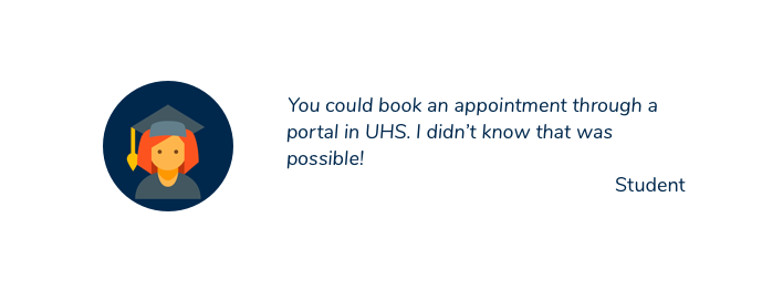
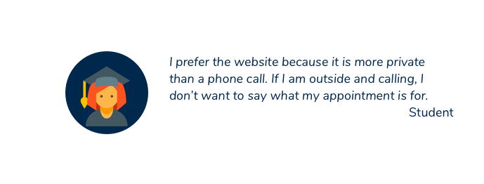
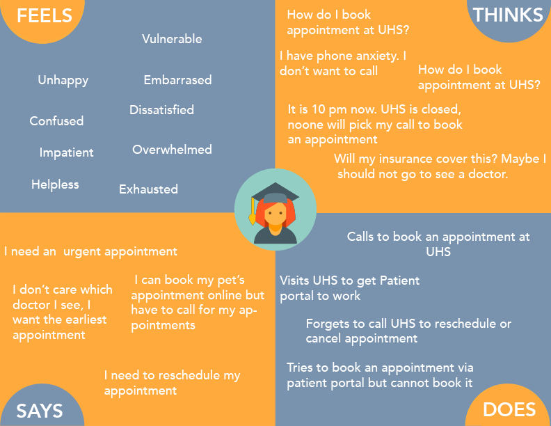
We conducted 7 user and 3 stakeholder interviews to understand user needs.
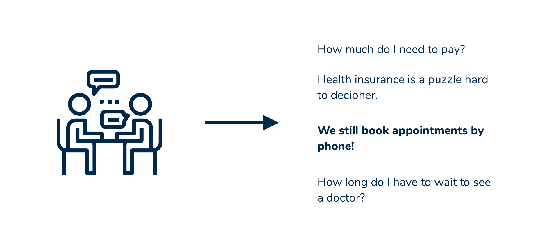
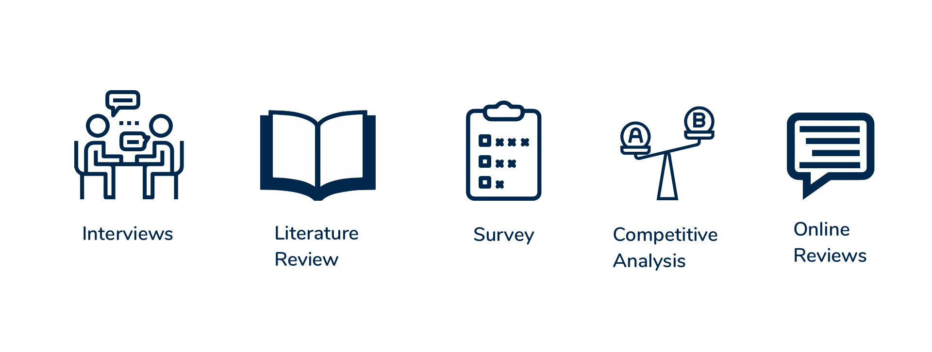
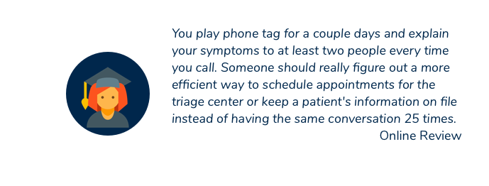
We read reviews of UHS online on Yelp (23 reviews) and Google reviews (47 reviews). The average rating of UHS on Yelp was 2.3 and on Google 2.8 on a 5 point scale. Many users mentioned that scheduling appointments is a pain through calls and there should be a better solution in place.
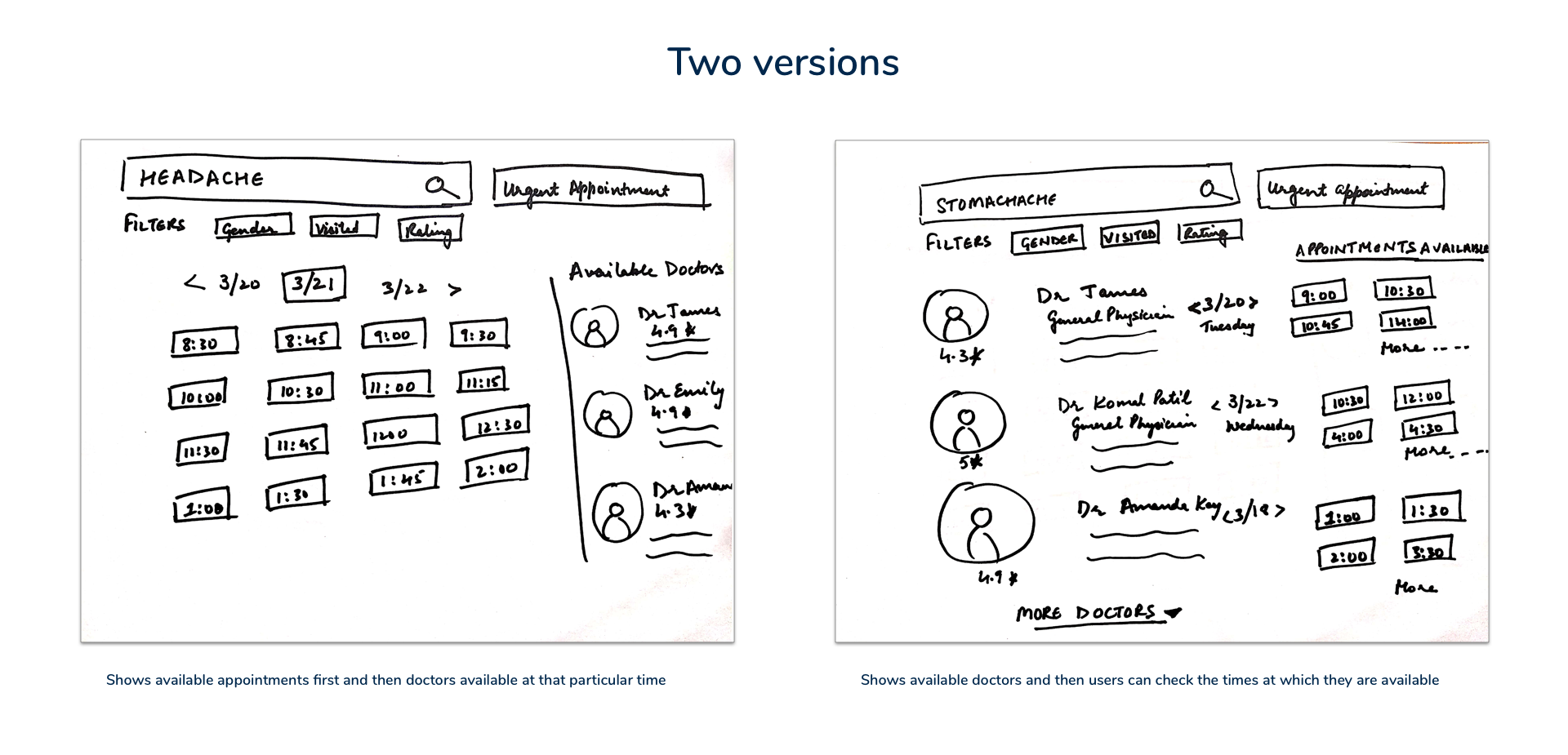
We created sketched for two different versions of our solution. Then we tested our sketches with 5 users to get feedback.
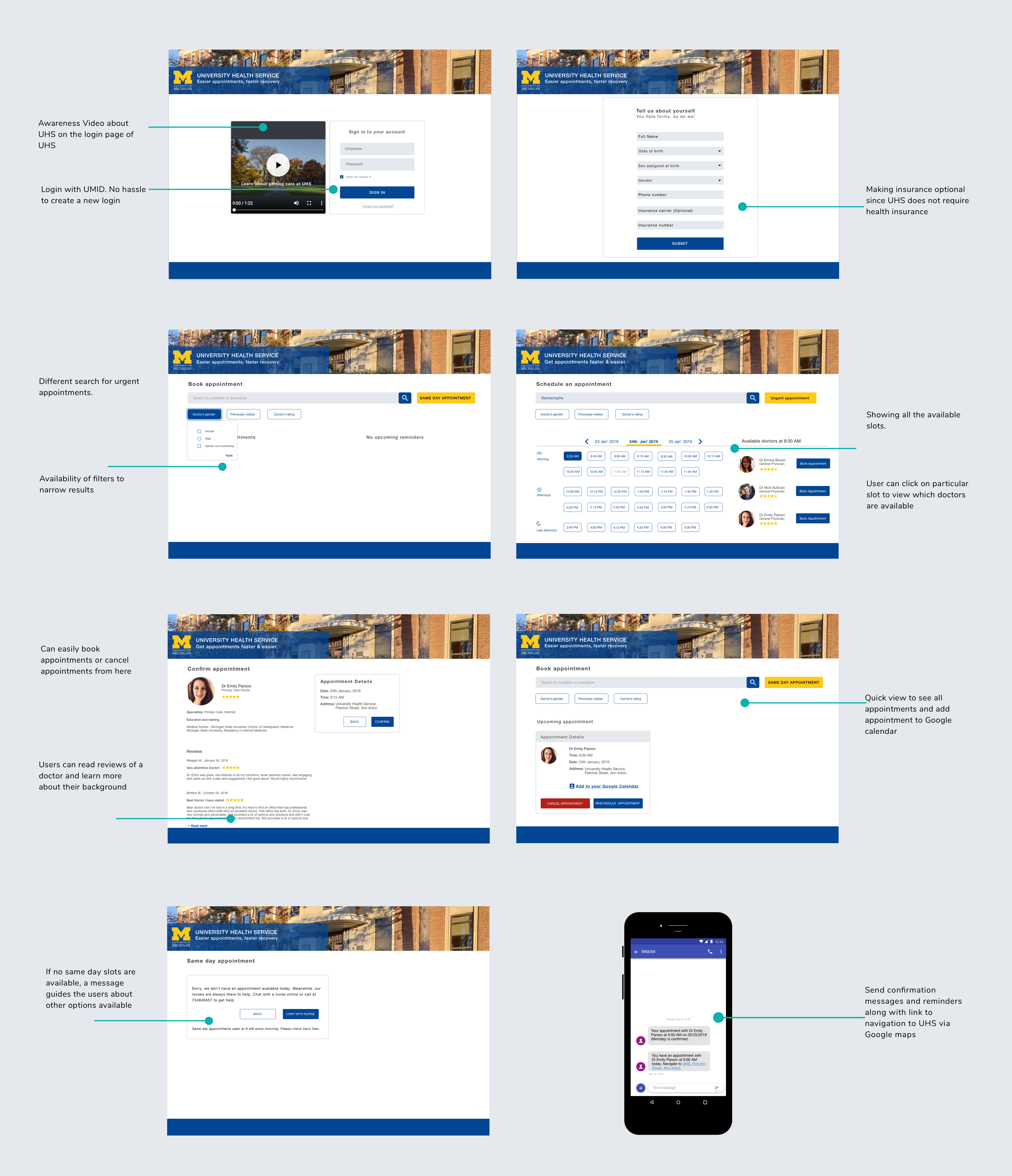
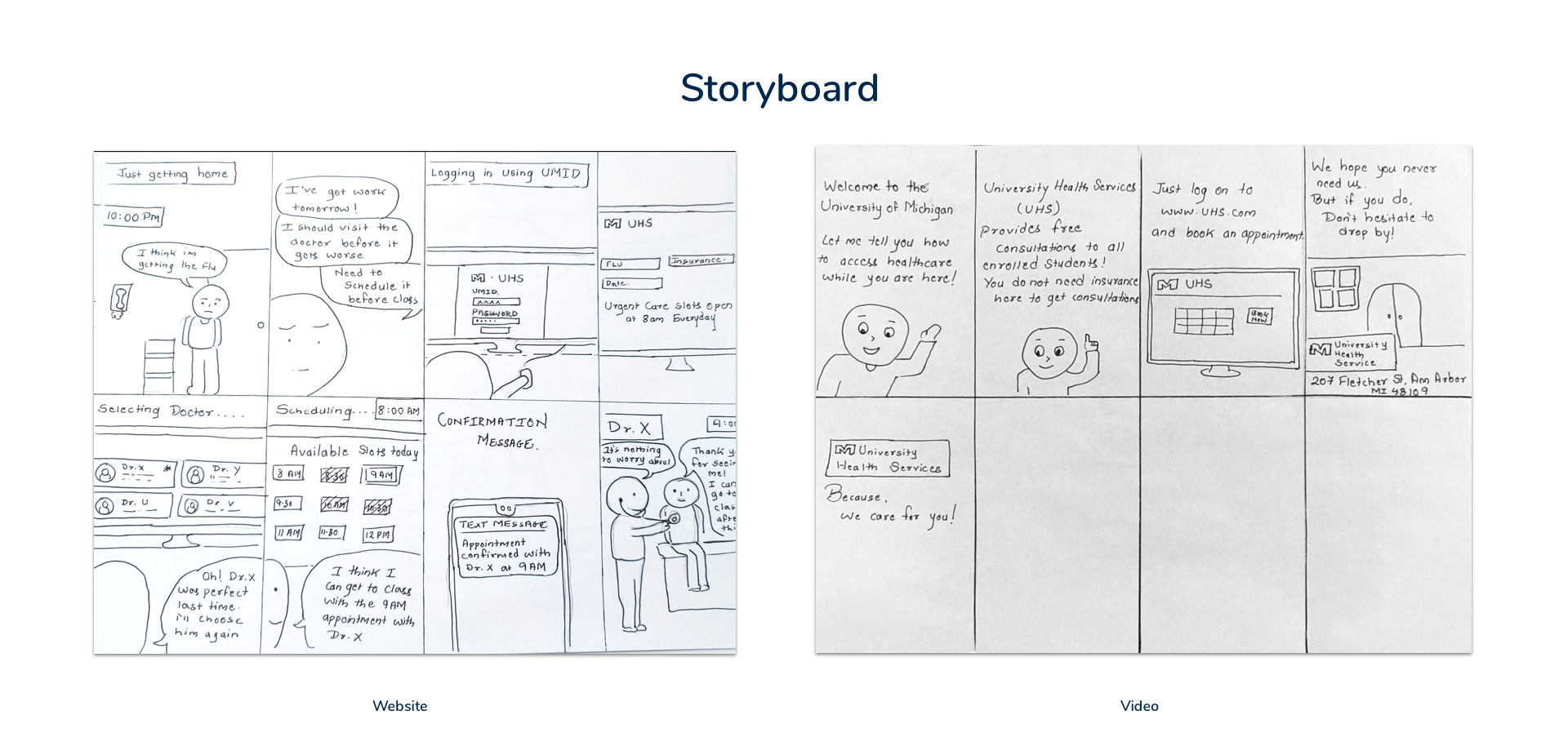
We created the awareness video for UHS which will be played at the orientation. The video is also embedded on the website.
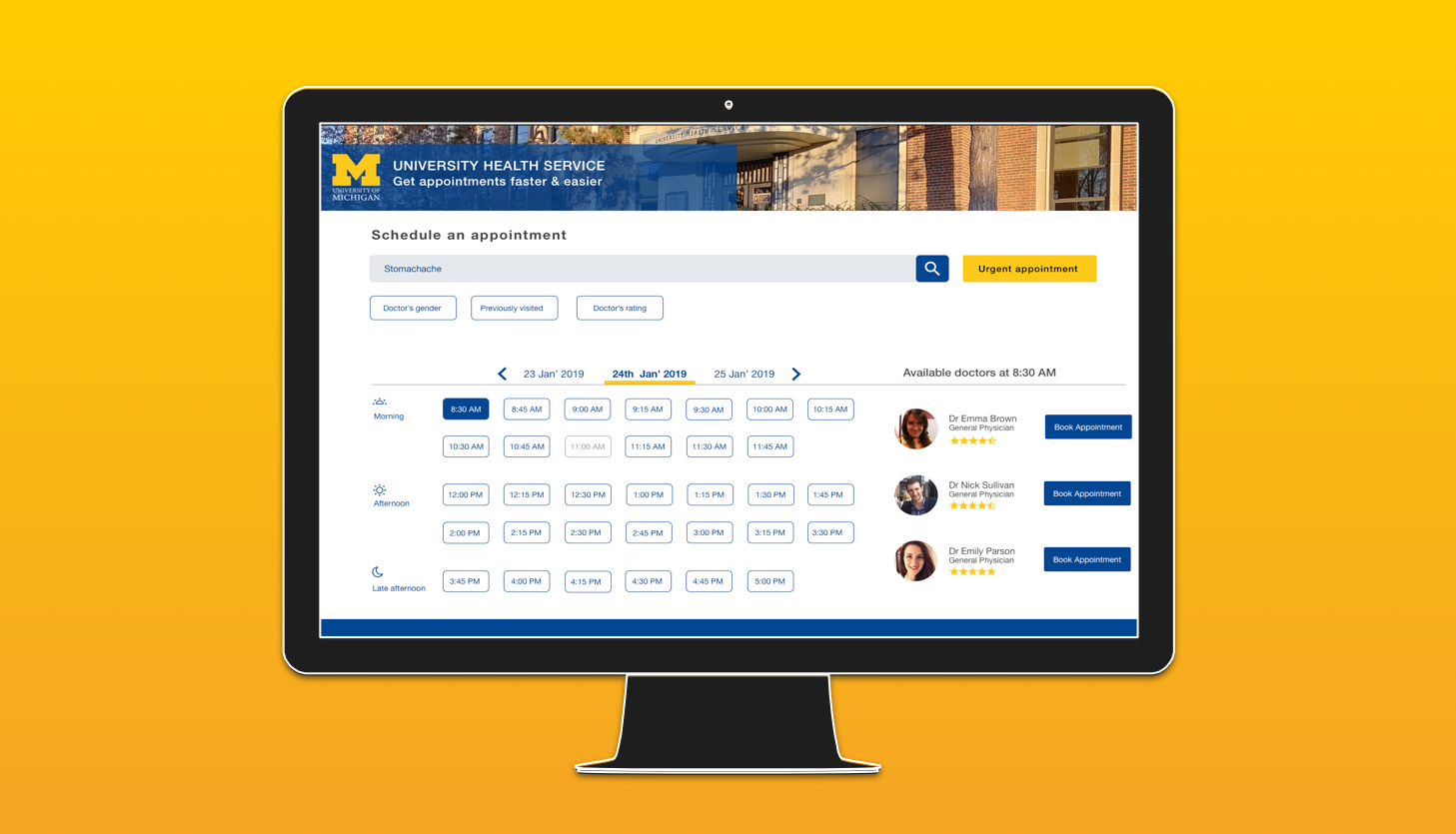
Try the digital prototype.
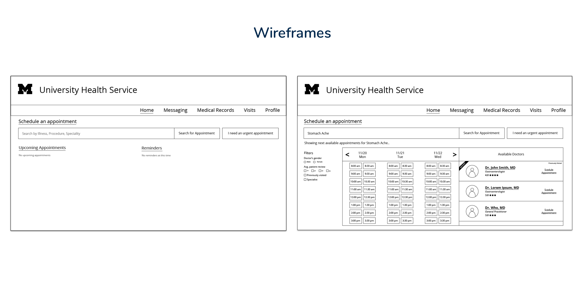
To evaluate our interface of our UHS portal, we conducted 5 usability tests. The overall feedback for booking appointments was positive but our reminder feature for urgent appointments needs some improvement.
Three participants were females and 2 were males. All tests were conducted in person and took around 20 minutes on average. We had a pre-test and post-test questionnaire. All the users were asked to perform 2 tasks. The first task had 6 subtasks and the 2nd task had 4 subtasks.
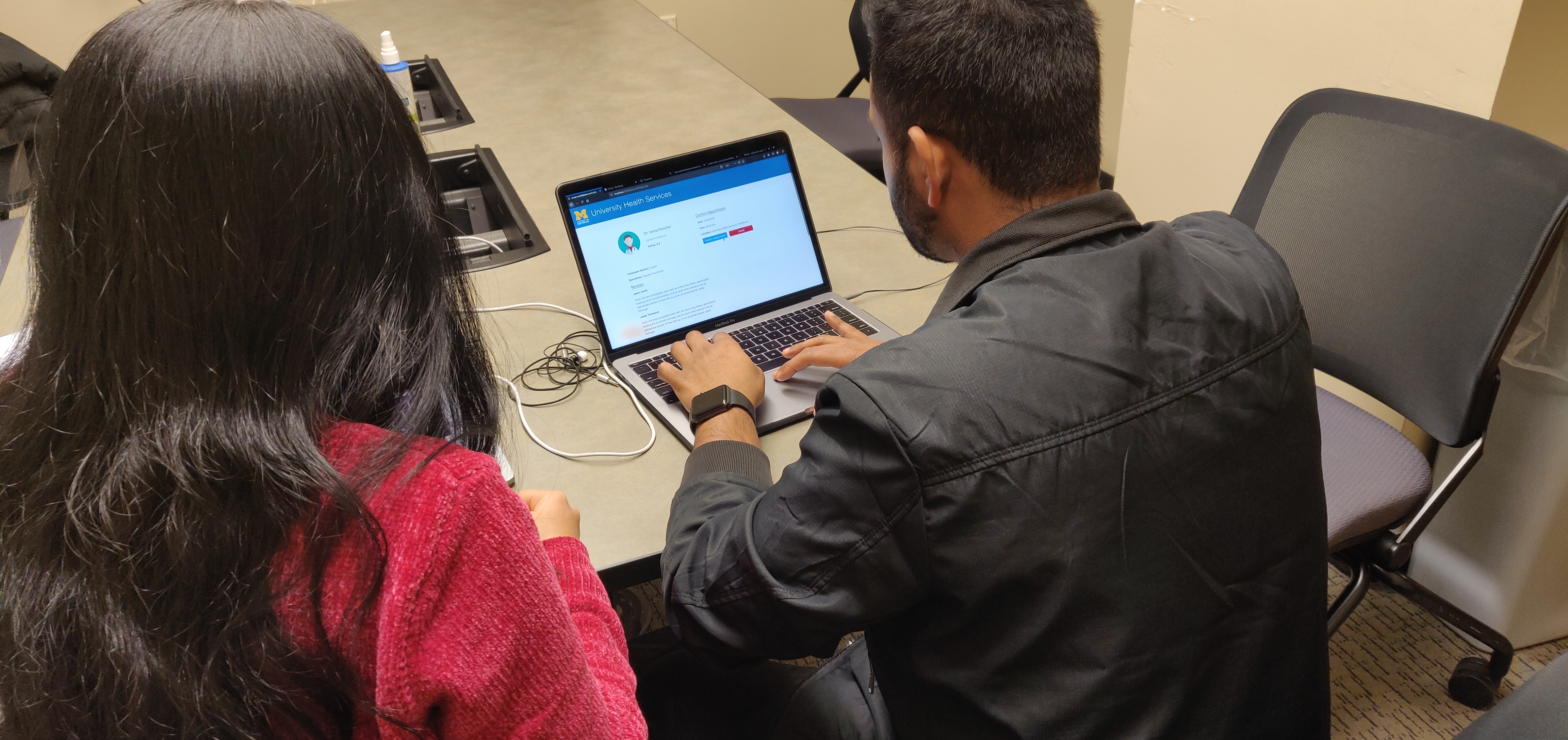
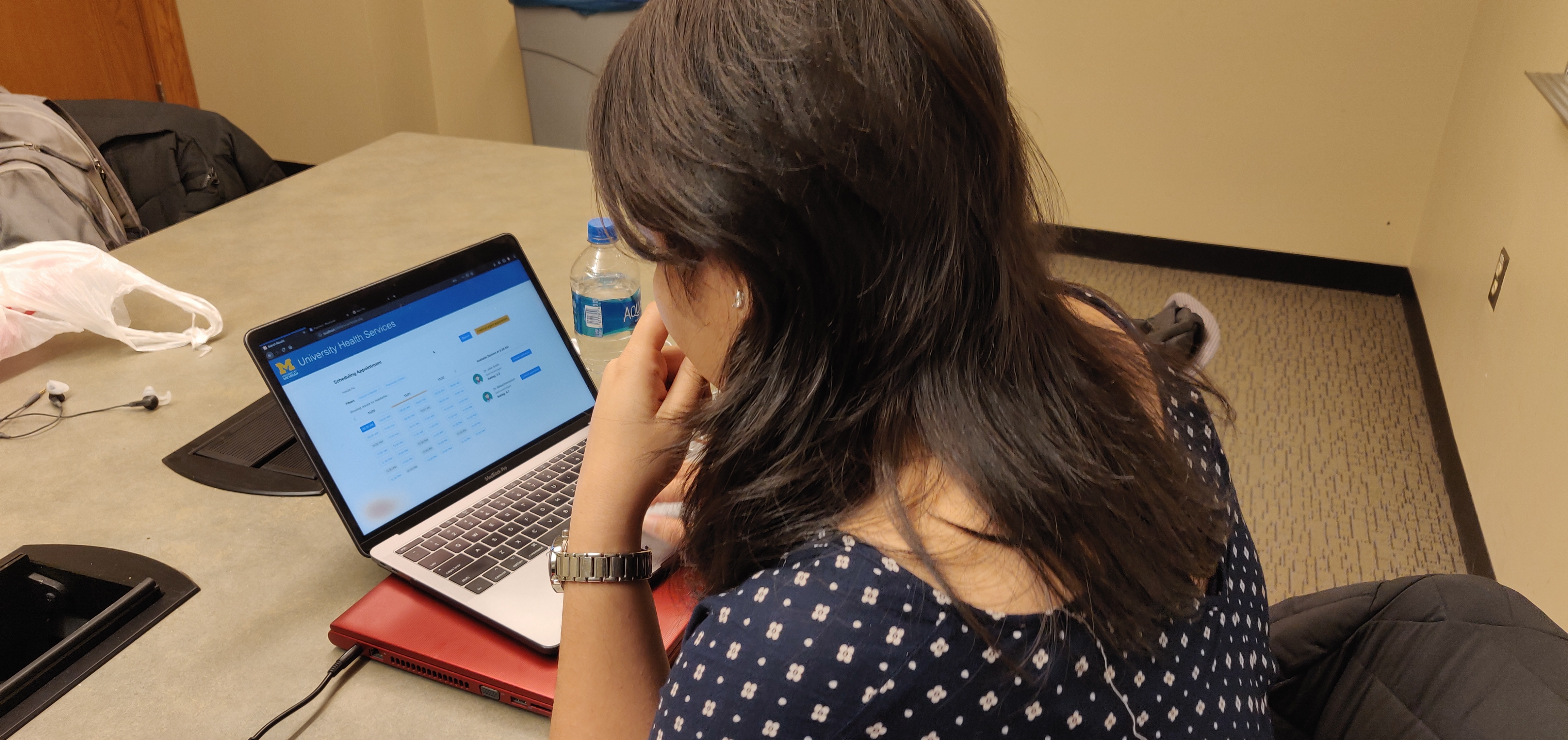
Users were confused about the reminders and most users were not familiar with the urgent appointments. Overall, the feature was not considered helpful by the users
Try the digital prototype.