Individual
UX Writer
The process started with user research. You can refer to the complete research process on the UHS Project page.
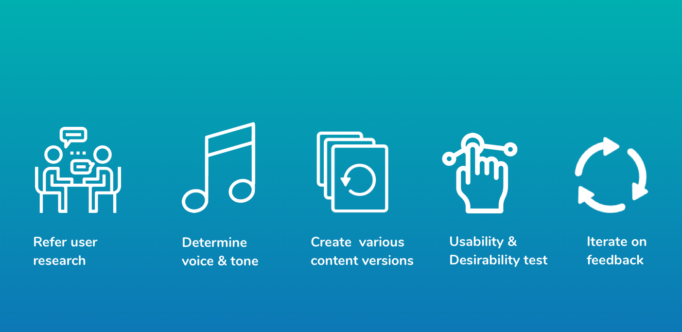
For voice and tone, I measured it on the following spectrum:
I recruited 5 participants and made them go through content on different pages. Although I created many versions, I mostly tested 2 to 3 versions of the content for both understanding and the emotion that evokes in them. I tested for different versions and asked them why they preferred a particular version. I asked users to rate it on the above spectrum. The results skewed towards serious, formal, respectful, caring, and matter of fact which is perfect for a healthcare system.
For the subheading, I considered the following options:
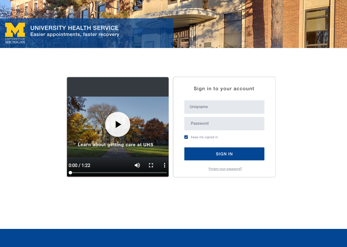
While some of them were too generic. I decided to test the first, second, and third options, users preferred the second version because it was reassuring. Easier appointments leading to faster recovery. Since this new interface is a deviation from the old one, users preferred the second option to the third.
Further, since the audience is all students at the University of Michigan, they are familiar with what the uniqname is. So, I kept the terminology the same as they see while logging into other accounts related to the University of Michigan. It was intuitive for users to login without even questioning if they need to create an account.

I tested 3rd and 4th version with users. Most users mentioned they would not care about the content here, they would most likely not read it when they are sick. I decided to keep the 4th version because if users actually read the content, it might be a bit delightful.
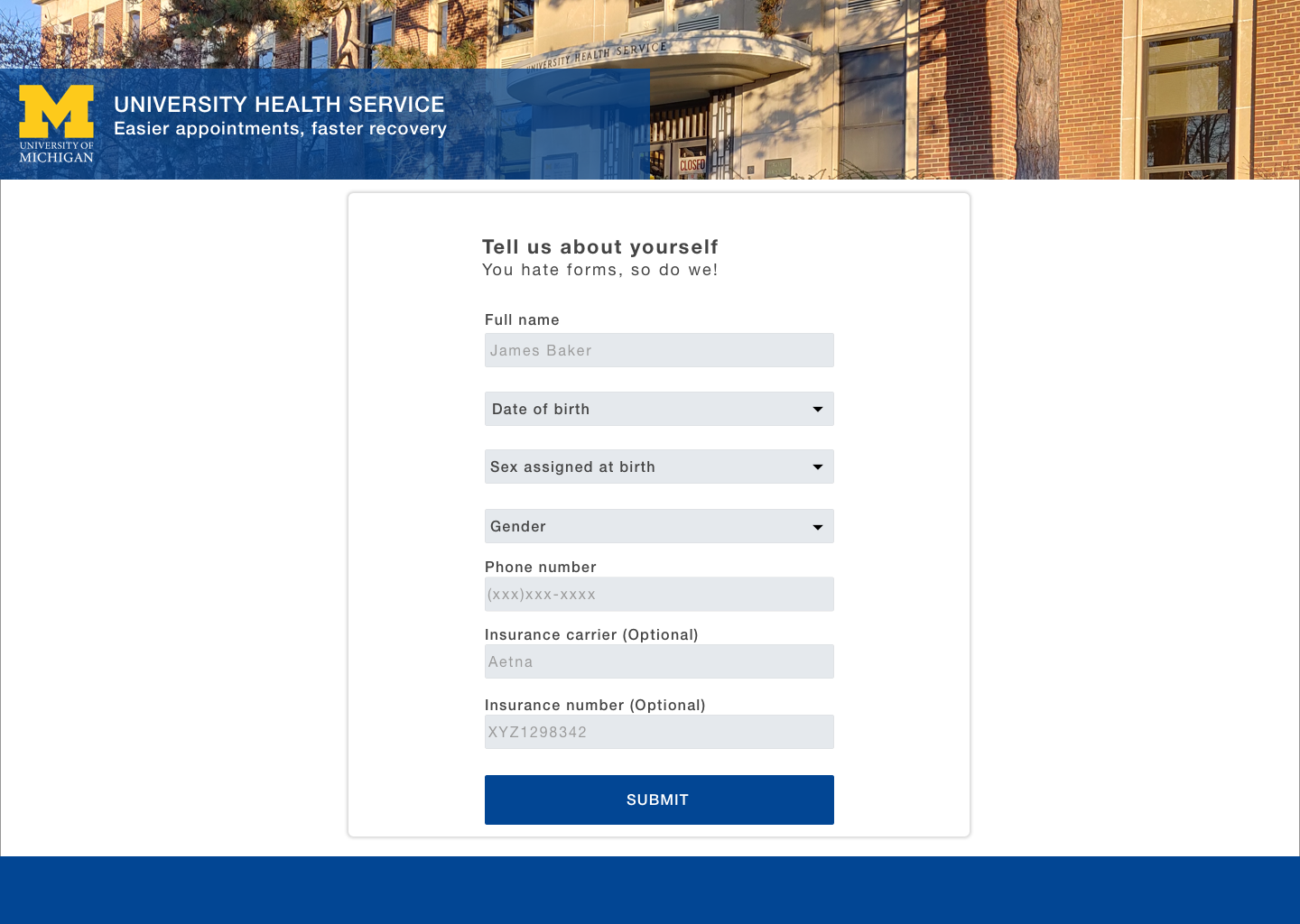
This webpage only appears once. It asks for minimal details and insurance is optional since students without health insurance can also get healthcare at UHS.
I tested the filters with the users and asked them to explain the meaning. All filters were clear to the users.

This page was clear to users and was not iterated after the feedback.

While the rest of the content was clear, the buttons were iterated after the feedback. The buttons were first called book and cancel. But users found them confusing since they had not yet booked an appointment to cancel it. So, I changed it to "Back" and "Confirm" after three usability tests and tested this version with the next two users who were able to understand this version.

I added the Add to Google Calendar option after feedback from users since they did not only want text reminders but also wanted to be able to add it to their schedule.

When there are no same-day appointments available, users get this message that guides them and tells them about their other options. I tested two versions of this message and users found this more caring. So, I decided to keep this version.

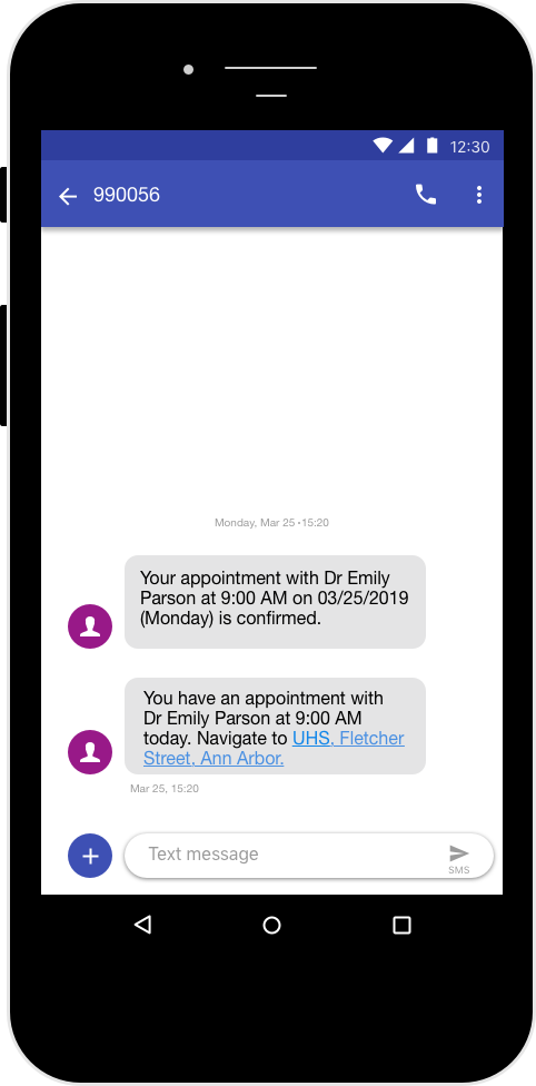
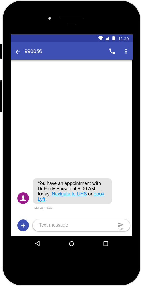
In the reminder message, there was a link to book Lyft but none of the users found it useful because they said that would not book a Lyft because UHS is right next to the school and they either walk, take a bus, or drive there. They said having a link to the complete address of UHS would help. The link then opens in Google maps.
